
Kooky Kouriers
Logo for Kooky Kouriers
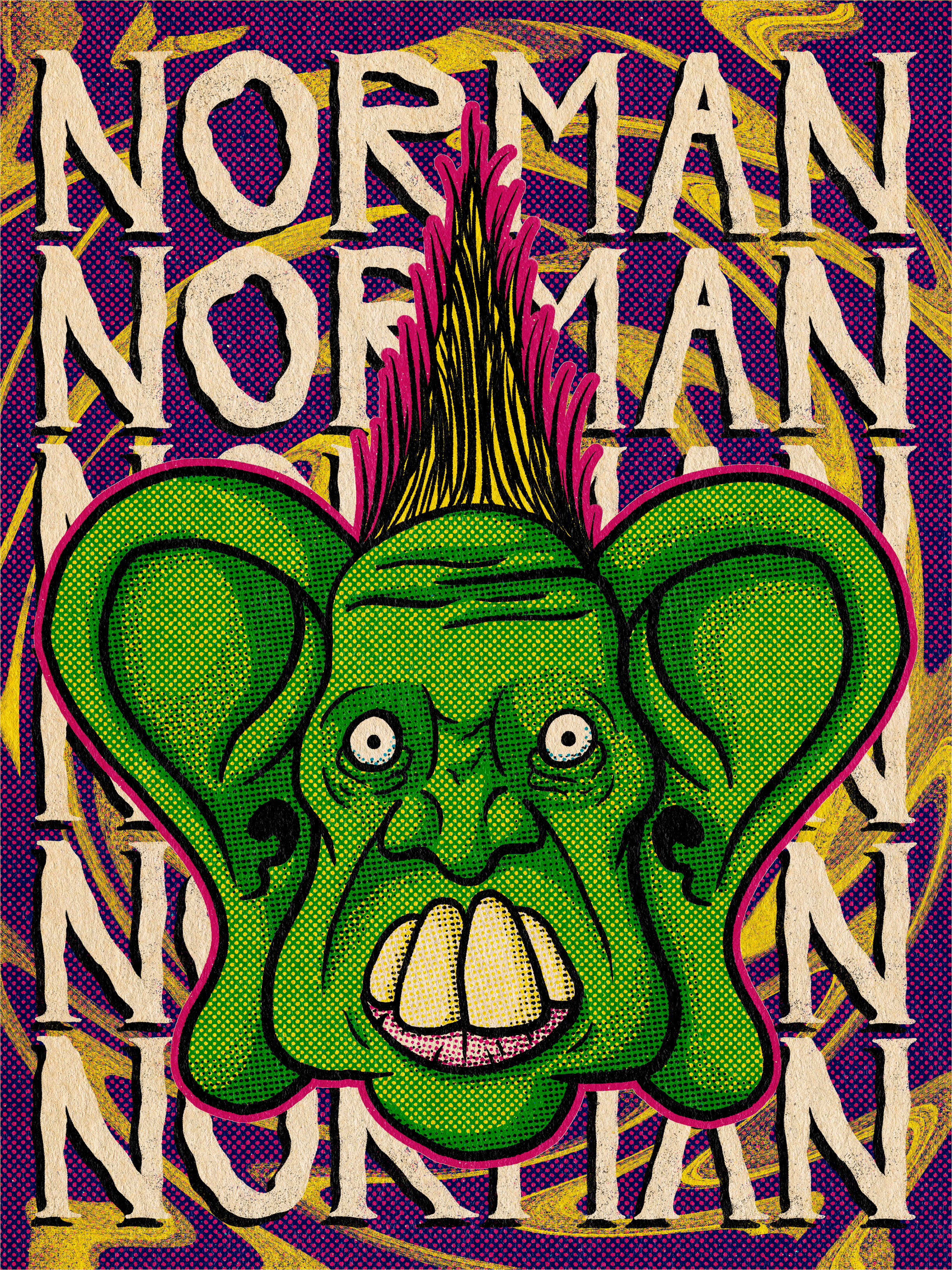
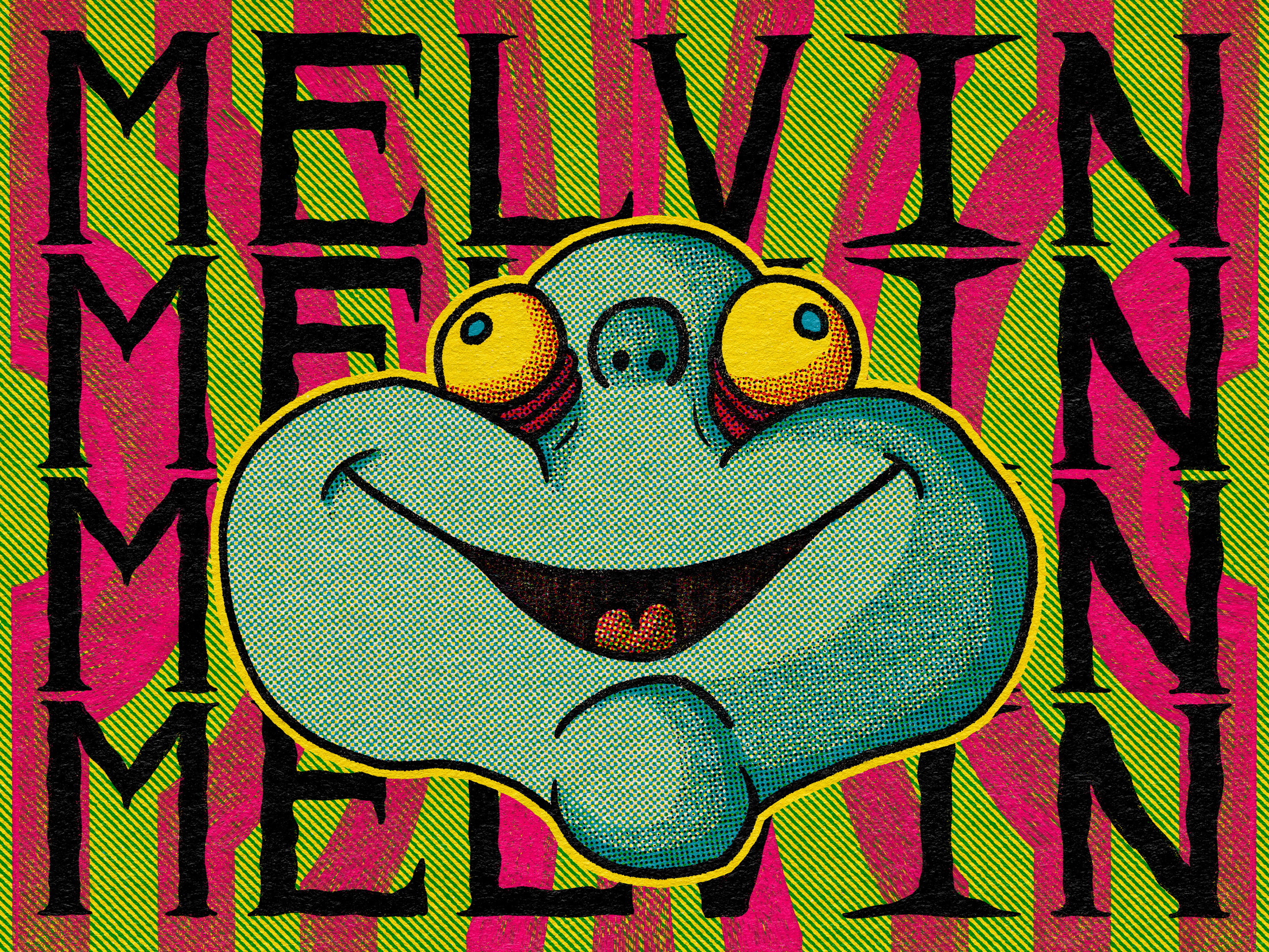
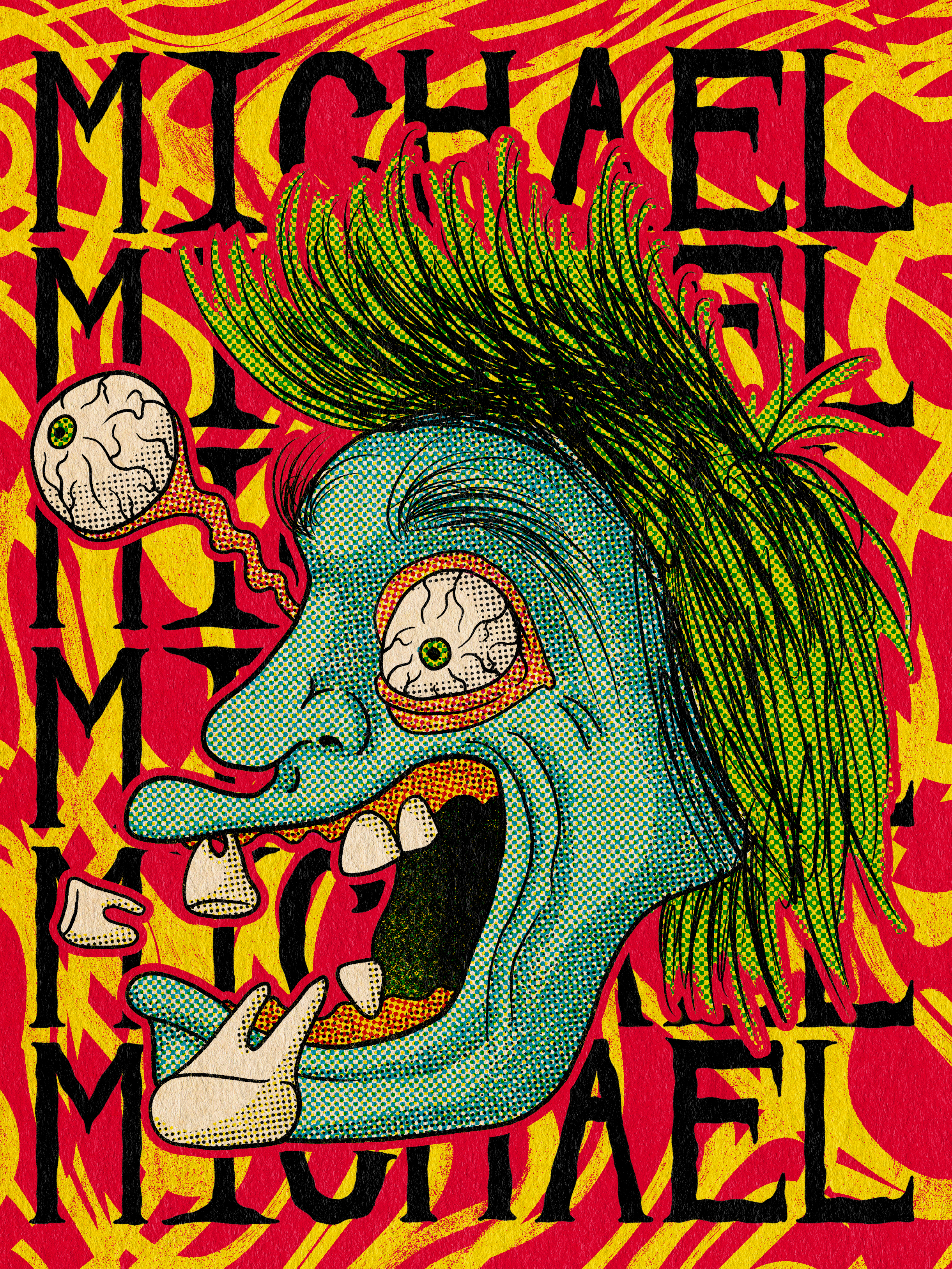
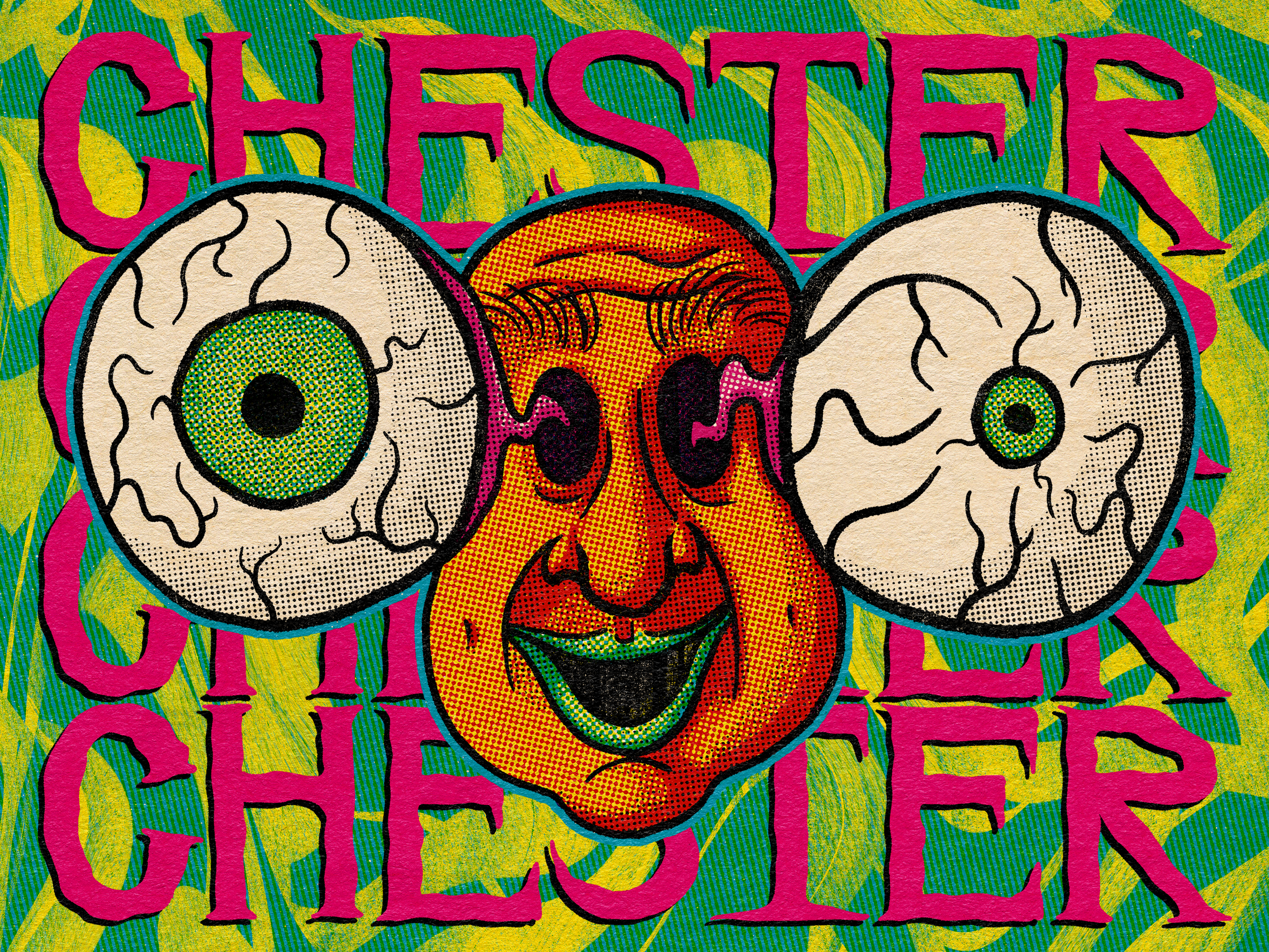
The concept behind the stamp illustrations for the Kooky Kouriers emerged from the need to encapsulate the brand's playful and quirky essence through distinct visual representations. Each stamp was designed to represent a fictional mascot that embodies various elements of the company’s identity, providing a whimsical twist that appeals to their audience. This approach involved an initial brainstorming phase where I generated multiple concepts, reflecting on how each character could encapsulate the attributes of the Kooky Kouriers. The whimsical nature of the business guided the design choices, ensuring that each stamp not only served a functional purpose but also engaged the viewer’s imagination and aligned with the brand's narrative.
The process of making these stamps involved several stages of refinement, beginning with concept sketches that served as a foundation for further development. I sought feedback after the initial sketches, allowing for revisions to enhance each design and ensure they resonated with the overarching branding strategy. As I progressed to final artwork, I carefully selected color palettes, typography, and styles that encapsulated a cohesive visual identity for the Kooky Kouriers. The result was not only a series of stamps but a complete branding package that included the logo design and the overall aesthetic. This holistic approach allowed the playful characteristics of the stamps to extend seamlessly into all facets of the company’s visual presence, resulting in a recognizable and engaging identity for the Kooky Kouriers.
Final Stamp Designs
Logo Iterations
Sketches
V 1.0
V 2.0
Final